Friday – Lion and Mad Hatter

  'My dear Royal Highness, the truth is in the details.'  'Hurm hurm, you may be right, Mister Haberdasher.'

Though I was conferring with a friend and apparently the last accepted common use of 'haberdasher' for a hat-maker was in the fifteenth century? Am I simply incredibly outdated? Apparently the correct use is 'milliner', which sounds faintly too agricultural.

To Contemporary Furniture

Please give me something new. Show me an awareness that people use these objects. Show me the flexibility that your new welding techniques and poured white plastic ought to help you achieve. Give Bauhaus, Corbusier, and Mies van der Rohe a well-needed holiday. Stop giving me things that look exactly alike.

Some indication, please, any indication, that you're not just being lazy.

What am I talking about? I shuttled across the web and my own bookmarks, and pulled out a few examples. Let us examine some, shall we?

1. Be aware of use by actual people. (Form AND function.)  

Furniture can be an art form, but what distinguishes it from a sculpture is its second dimension of utility. (More on decorative furniture later.)

Dimensione Disegno released a Cordura-covered outdoor chair:

The fabric, while durable for all sorts of weather, must be exceedingly difficult to remove and clean. One could argue one has 'people' for that sort of thing, and certainly those who can afford designer furniture 'ought not' take that into account, but I think it's a pretty poor showing as a design for being both impractical and ugly. Even if the fabric generates volume and comfort, the clothed-paperclip look of the thing makes me wonder why they made a concession to back support at all. There's so little for the lumbar there that they'd have been better off with a cloth box.

Speaking of paperclips, tell me, Jane Hamley Wells, what really is the motivation behind this Barcode Armchair (first picture)? It reminds me of mind-boggling designs like Birdman's Oscar chair, IKEA's structurally unsound Jesper bench and Frajumar's Onda armchair/lounge, respectively:

There's no bodily support for any of these. It looks like I'd have to be box-shaped for the first two, with an unhealthy predilection for sharp edges and no back support. This weekend, I saw the Jesper in person. My friends and I took a few moments to figure out how to sit in it. Creatively engaging your audience, check. Structural support, fail. Even the lightest of us felt like they were about to fall off, and we measured how much the central beam bent on those thin paperclip wires. As for the Onda, it looks nice, yes, but it's so narrow I pity the equally-thin model trying to sit on it.

I wouldn't mind putting my child on this Coco from Bloom, though:


2. Be unique.

It is hard to design a unique surface, whether it's a bed or a sofa. You can sleep, work, play on it, but on the whole, a bed is just a flat plane. It's simple purpose, however, is what makes it such a wonderfully blank canvas to work with.

So why do so many contemporary designs look identical to me? I understand financial concerns, especially today, make one think twice about unique furniture for your office or home, but these are designers, many of whom are charging more than IKEA prices for these pieces. Horizontal low profile planes are all the rage, yes, but topographically uninteresting for even the best white epoxy flooring. Beveled edges + rough upholstery + asymmetric backing + flat^100 is not a winning formula when it's the same as the next design desk's. (From left to right, Vincent CadenaWest ElmDanerkaThe Home KeyBontempiWiemann, and Arketipo. Links direct to product pages where possible.)


Fear not, here are a few designers who are doing it right. I see these as the perfect blend of form and function. The shapes and lines of these pieces can be interpreted in different validways (whereas IKEA's Jesper has no valid utility in any of its interpretations). The staying power is inherent in the changing ways people choose to use their surrounding furniture.(From left to right, Tim KerpFred RieffelCrystallizeAlexander Kneller, and Feelgood Designs. Links direct to product pages where possible.)


Before you rise up in arms about the importance of suggestion, aesthetic design, theme, programme, or whatnot, I do have some examples of what some might prefer to call 'decorative furniture'. I leave it at that and simply call it sculpture. Here are a few examples of the good:

Brodie Neil's @ Chair. (I love his work) Karl Andersson & Sönerbeautiful 6mm Thinner table Moroso's Shadowy Chair.


These are quirky and beautiful examples of decorative furniture. Their basic program is in deference to their function, but I prefer relishing their visual rather than functional appeal.


Here is the bad:

FurnID for Fredericia's Dekka daybed, the most uncomfortable piece of decorative furniture I have seen in a while. If you get a chance, the description reads like a parody of art criticism, 'soft yet hard, white yet black' et cetera. Defne Koz for Megaron's stainless steel Dondola chairs, which I refuse to believe is intended for a 'domestic environment.'


So now that I have gone through this brouhaha, what is it I really do like? I leave you with two simple, unassuming pieces. The form and the function complement each other, and have some degree of the modular furniture's flexibility. More importantly, they accommodate their future context, which is always a challenge because you can put these pieces anywhere. I can see myself using these pieces every day, and appreciating the good design that went into them. 

Arcadia's Hush modular seating, supportive, flexible, and respective of private needs in public spaces of varying shapes and sizes. Stefan Heiliger for Leolux's Parabolic armchair. I can imagine reclining in this so easily.


Just remember, there is only one way to sit in a paperclip chair: uncomfortably.

Photo credits: property of their respective designers. Some examples sourced from Contemporist.


Daily Moleskine Sketches

Two years ago, I made a New Year's resolution: take one photograph a day. I called it the 365 Project. That worked out quite well, and I managed it with the exception of a few memory card snags. This year, I wanted to do one sketch a day, but with taking a break from law school and holiday traveling, didn't manage to think about it until now. Which is sort of the point, I guess, that I stop and commit myself to one sketch a day.

The most ready medium for me is a plain, small Moleskine notebook. It's easy to carry around, and has passable paper even if it's not the Moleskine sketchbook. I'm most experienced in pencil and watercolor, but I think that sort of thing might have to be reserved for special weekend posts or end-of-month posts.

What do I use?
  • Kokuyo Calsh PS-131 0.5 mechanical pencil
  • Sakura Pigma Micron 005 and 03 – black
  • Sakura Pigma Brush – black

Now that I have committed myself to this, here we go!

In-Between Places

We spend so much of our lives in in-between places.  Airports, cars, train platforms, subway systems. As a child, I felt they were places of waiting. Events waiting to happen. Relationships waiting to be. Lives waiting to change. Every place was a window into a different world. 

On long road trips, I used to lie down in the backseat of our family car and stare out at the skies that passed. Telephone poles connected voices and big neon signs gave way to the quiet confidence of forests and cliffs. I would imagine that at any second, I could tumble out of the car and onto the shoulder, and simply start walking. Or perhaps at the airport, I had a different ticket, not a wrong or right one, simply a different one, and I'd walk through a separate gate into a new life I'd have to invent from scratch.

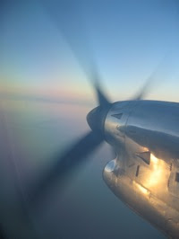
As I got older, I was waiting in airports and on subways more and more. When the surprises on your identical morning commutes merely produce inconveniences, waiting becomes more of a chore than an exciting path to the unknown. Long airplane rides make your knees seize up no matter how many times you walk up and down the aisle. The soundtrack of 'Please mind the gap' or 'Next stop Copley' becomes less a charming jingle and more a tiresome wheeze. 'Jet-setting' means knowing how to breeze through airpot security within half an hour, and to pack in about just as much time. Airports and cars were never places to be, of course, but even as a child I thought they held some magic of possibility. Now they have become delays.

Yet I still love in-between places. When you're a kid, your dreams are more abstract, so 'in-between' feels more like possibility. It's better to imagine the promise of something amazing rather than expect life to bring you no more than what you faced the day before. With more experience though, as if by symbiosis, in-between places have changed along with me. I am an active variable in the airports and platforms and stations that serve as microcosms of humanity. I'm not wondering what's next, I know what's next, because I'm planning it, I'm changing it, and I'm responsible for it. My itinerary is my own, weather and technical difficulties notwithstanding. 

A few weeks ago in Logan, I sat up with a start from my Monocle and foolishly, stupidly, began to smile. Passengers were bustling around, children were glued to the large windows overlooking the tarmac, and I was waiting. Not for the unknown, but for what I knew was next. 

Instead of possibility, in-between places now have purpose

Photo credit: Jennifer Z. Gong.
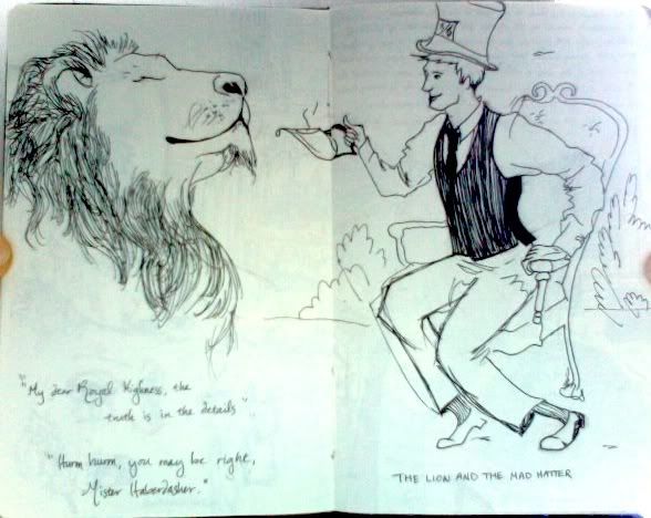